Let me tell you a story! I have remembered it from my youngest camera days, and it is an exciting story about the Quest for Good Pictures. It goes like this.
Once upon a time, someone very curious wanted to discover a secret. He was wondering, why are some photos Good, the other Not So Good - or anywhere betwixt and between Bad to Awful.
Being clever and resourceful, Someone thus set up a great big table full of photos, and beside the table he put a chair. He then invited many people from all walks of life and asked them to sit down and separate the photos in two heaps. One heap should contain Good photos, and the other those that the person thought of as Bad. There were no other instructions.
The photos were various; ould and contemporary, large and small, multi-colored, black and white, monochrome too... and the themes these contained were also as various as can be. There were landscapes, human or inhuman portraits, animals fighting, animals abused, all kinds of pretty dames, and also forensically ugly documents. There were objects from everyday life, of torturing tools, quartered corpses, squashed bugs, rotten food, kingly meals, weapons, pretty dresses and the rags... whatever you imagine, it was there!
And every photo carried its unique number on its back, so the groups of chosen as Good or Bad could later be recorded.
When one person was done separating the photos into the groups in accordance to their opinion, all the numbers of the photos chosen as Good were noted. Then the next person was invited and asked to do the same. Then the next, and the next, and the next. Many people sat on that chair and used their emotion, instinct, education, wisdom, ethical and whatever other virtues they posessed to perform this simple task. And every result was written down. It took time and effort, but the best was yet to come.
When all the people finally did their job of deciding what's Good and what's Not among all the photos, the Curious person browsed through all the records, seeking out the photos that all the people had proclaimed Good. Then those were extracted from the mighty Heap, and the Measuring Phase begun.
Well, we do not speak here about unsharp, overly dark, or too light images. The quest was not about correctly exposed, sufficiently sharp photos with clearly visible detail. That is what we'd call "a given". The idea was to discover if the Good photos mainly meant those that were easily "readable" or easy to understand for the most of people. And if so, then why?
Every Good photo was measured in many ways, its content and layout analysed, and soon certain patterns began to emerge. Some relations between the elements within the photo took shape, and curiously, quite regardless of the photo theme.
Good photos had a story told by inner tensions and intensity of forces that operated among the thematic elements. The readable photo story is/was in a way proven to have some invisible connecting lines that lead the eye through the content, something like a "connect-the-dots" puzzle which, in the end, reveals what the author of the photograph has seen and felt, and also wanted you to see and feel.
The combination of geometric and subliminal set of dynamics within an immovable content has been analysed for more years, and what has cooking in the mind of the Curious person has boiled down to several sets of "rules that are not rules". It was the basics of a subtle grammar within the Language Of Light that we all learn how to read and speak. We use these recommendations, or if you want "rules" to better tell our photo stories to the viewers.
I won't bother you with all of those, don't fret. I'll just try to explain maybe the most popular one among them. But I'll add another curiosity for you to ponder upon when you're not on internet and your brains operate at optimal temperature again.
Curiously, the old paint-and-brush masters and the crayon or coal virtuosos which lived many centuries before the first photo camera was even imagined... they knew about all this! And their works clearly show that they had played their canvas, fresco and papyrus surfaces with divine sense for optimal use of space and action, even when doing utterly static scenes like landscapes. Howzat for a miracle, whachasay?
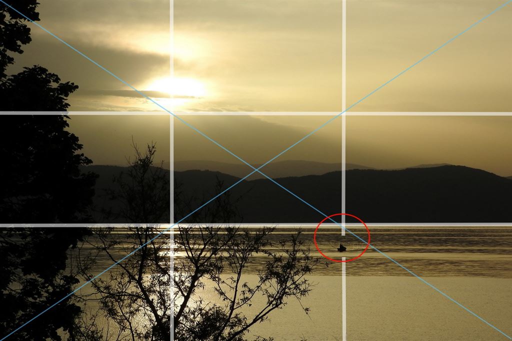
About the Rule Of Thirds, aka the Golden Cut... These are not quite the same, just similar enough for their differences to be disregarded. The Rule Of Thirds seems more popular now.
What we used to call a Golden Cut suggested the placement of point of interest at the spot where some thirds line crossed the format diagonal. The diagonals should ideally show contrast at their opposite sides; such as light <-> dark, rough <-> smooth, close <->far, etc.
We humans are stereoscopic. This means, we use one (dominant) eye to discern things, and the other eye serves the distance-measuring and movement-checking process. We only sharpen or "focus" with our dominant eye, and use the off-center view of the other eye to check the distance and movement of an object. It is an atavistic remnant, when the way of efficient looking meant life or death, safety, food, mating, escaping danger, etcetera.
Now, because of two eyes our field of vision is roughly elliptical. The two foci of our visual ellipse appear to be specialized. When an object is in one of the visual centers, it corresponds to our way of "looking at it". Any movement, color, anything out of the ordinary triggers us to look at it, and this usually happens in front of our dominant eye. It is at about 1/3rd of our vision width, where one ellipse focus resides, right? Or left?...
Our photos are presented as rectangular fields originating within our visual ellipse, and we present these fields with various side ratios; from wide and low panoramas to "landscapes" or "portraits", to square format. We can't practically present the whole elliptical field of vision, but we make do with what the technology allows.
To compose an image for the Rule Of Thirds we help ourselves by superimposing a grid of two vertical and two horizontal lines laid over some scene. Through such grid we see the area separated in three horizontal and three vertical fields. Sketch it over some newspaper photo to visualise what it's all about.
These four lines cross each other at four points. You put the part of the photo that you mean to highlight at any of the four points where the grid lines cross each other - and then it is right where our brain translates it as "that's important". This is because it is in focus of one of our eyes. And because that's how our firmware trained us to look at the World from the times when we still dragged our hands on the ground while walking.
So why are there horizontal and vertical thirds? Our World is horizontal, so our field of vision is wider to the sides. Let's say, we see something happening on the ground. Within the rectangle of our photographic format, we present it by assigning the lower two-thirds to the ground (where the action is), and the the upper third is the sky, for reference - it gives us the sense of size, perspective and distance in the photo.
Naturally, if we place our photo theme at any of the above explained four points, we thus proclaim it important! It is the way we say to the viewer, "this is what I'm showing to you!"
Usually any action should develop from that point toward the image center, not to the picture rim! That is how the action remains contained in the format and makes a story, see?
Ditto, when the action is in the air, the sky gets the two thirds of space, and the remaining third of the ground becomes the area of reference.
Horizons smack mid photos with the sunset in the center is soo boring! It is painfully static. There is no energy flow and your pretty photo appears neutrally balanced, undecided, a no-title piece. Just try to re-compose it following the Rule Of Thirds, and you'll see the difference.
Simple as cheese, right? :) Try looking at the pictures you instantly like, the ones that you can read a story off... and note these compositional layouts. Fun!
Another thing... the Rule Of Thirds works with all formats, vertical or horizontal or square. Our medium format is sometimes dictated by the theme, at times also by the available space. Sometimes we see vertically oriented landscapes, at other times we see high trees shown in a horizontally laid-out spread. But there should be a reason for such decisions, reasons better than sheer laziness that brought us vertically laid-out videos, just because people think phones are higher than wide! Duh! Thass how iss bin bilt!
Don't take the Rule Of Thirds in any martial law sense - it is just a recommendation. Same as many other photographic "rules", like spiral, convergences, diagonal etc., it is just a way of helping the viewers to read your photo stories easier. Some images might also require more action field and less reference field, so it's not like it is some hewn-in-stone gospel. But it is good to try and compose by this principle, and only modify it when necessary.
I hope you liked the story. And thank you for your reading effort and patience!
Enjoy the Good Light!